 International (EUR)
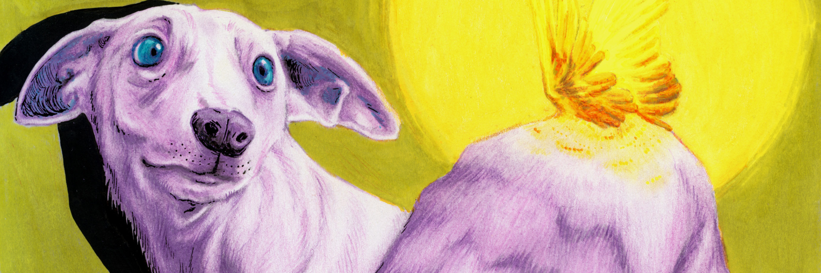
Petra Oravakangas - one of the winners of Pen Store Talents 2023.
How did Petra manage to create her wonderful work with the help of 8 completely randomly selected pens? In this interview, we get to see her creative process and how she went from idea to final motif.
Hi Petra! Tell us about yourself and how you find out about the competition
I’m Petra Oravakangas, a 29-year-old illustrator from Lahti, Finland! I have a Bachelor’s degree in graphic design, but besides illustration I’m also interested in so many other things: traditional oil and tempera painting, printmaking, bookbinding, ceramics, recently even got myself a tattoo machine to try tattooing as well.
I heard about it from a friend, and at first thought it was very interesting but also a bit scary. I like staying in my comfort zone when it comes to drawing – colour pencils have been my main technique for years, and I don’t really like mixing them with other techniques such as markers. But I had some time in my hands, and really wanted to give it a go.
What was your first reaction when you saw the pens in the competition kit?
To be honest, I was not that happy! I usually go for muted, dark and earthy colours, and seeing the neon yellow, bright turquoise and light pink in the kit really confused me at first.
Have you tried all the pens before? If not, how did you go about "getting to know" the new pens?
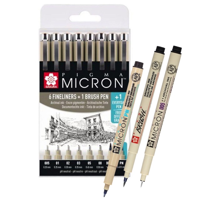
Exactly half of the brands I was familiar with – the Faber-Castell pencils are really a staple in my drawing kit, and I have also used Pigma Microns, Sharpies and Promarkers in my sketchbook drawings.
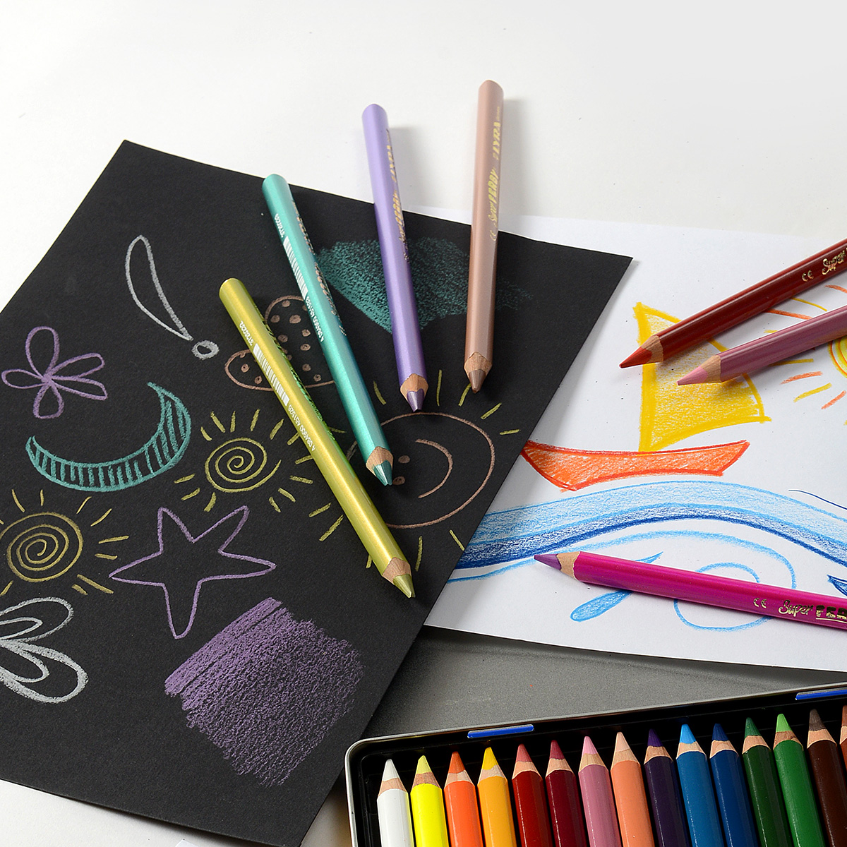
At first I tried all the pens on white paper on their own to see the colour palette I was dealing with. After that I tried all of them on top of each other to test how well they blend together. Later I also tried the pens on coloured papers, like pastel papers, but realised the palette is better on white paper. With the colour pencil, metallic pencil and the watercolour pencil, I also wanted to see how rough or smooth their texture could be.
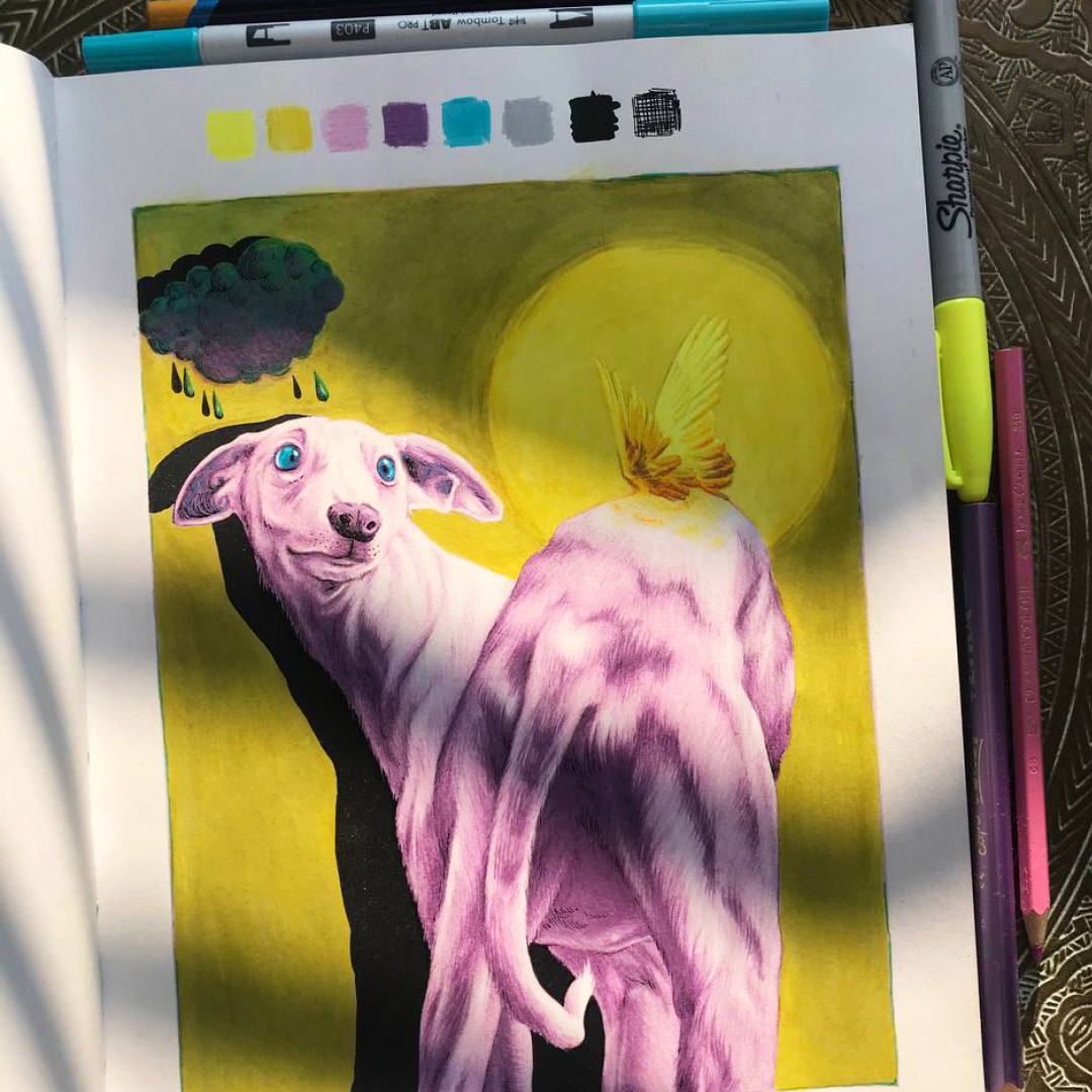
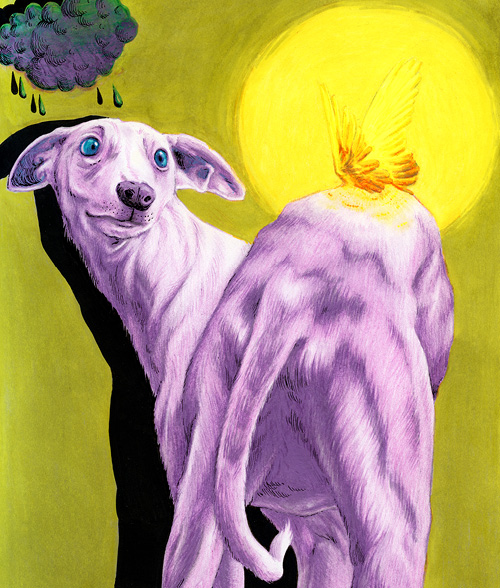
Can you tell us a little bit about your submitted work? What was your inspiration and thought behind the motif?
I simply went through my folder of “good reference pictures”, which I usually do when struggling to come up with ideas. I’m kind of a (sur)realistic illustrator, and the bright colour palette threw me off at first, as I was struggling to come up with any ideas that would look good with these colours. I was far away from my comfort zone.
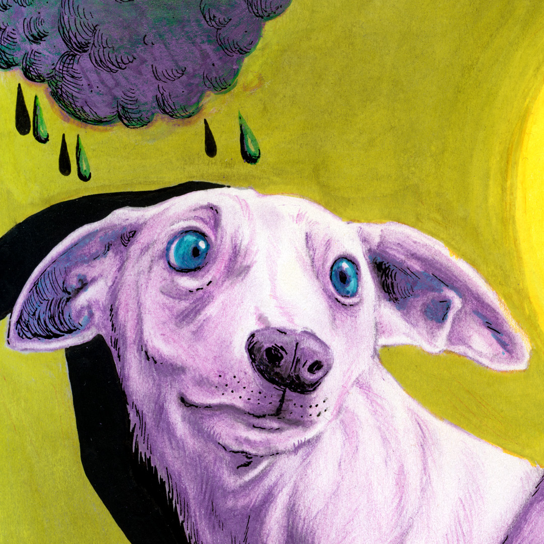
In my reference folder I’d saved a lot of pictures of very expressive animals, and I found this photo of an italian greyhound with big, human-like eyes, and something about just felt right. The dog was looking very hopeful but a bit nervous, and that’s exactly how I was feeling about the competition!

How was your process, from idea to final result?
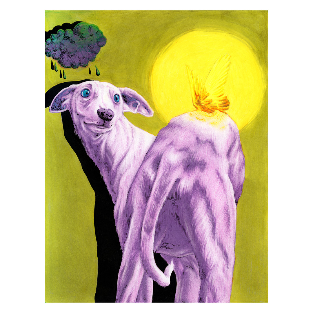
When I had decided on the greyhound motif, I just threw away all thoughts of a realistic-looking colour palette. When I tested the pens, I was super impressed with the neon yellow Sharpie, and immediately wanted to make it the star of the show. I’m a huge believer in opposites when creating a colour palette – usually going for blue and orange – but now realised I should go for purple and yellow. So I decided to make the dog purple (and pink), and grow a pair of little neon yellow wings on his back to brighten up his day. That’s also how I came up with the name for the illustration – Here comes the sun!
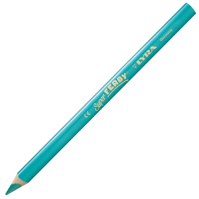
I had never used metallic pencils before, and was quite impressed with the softness of the purple Super Ferby. It blended really effortlessly, especially together with the Faber-Castell pencil, and creating the texture of fur with them was quite fun. I was really lucky to get these two well-matching shades, as not all pinks and purples really go together.
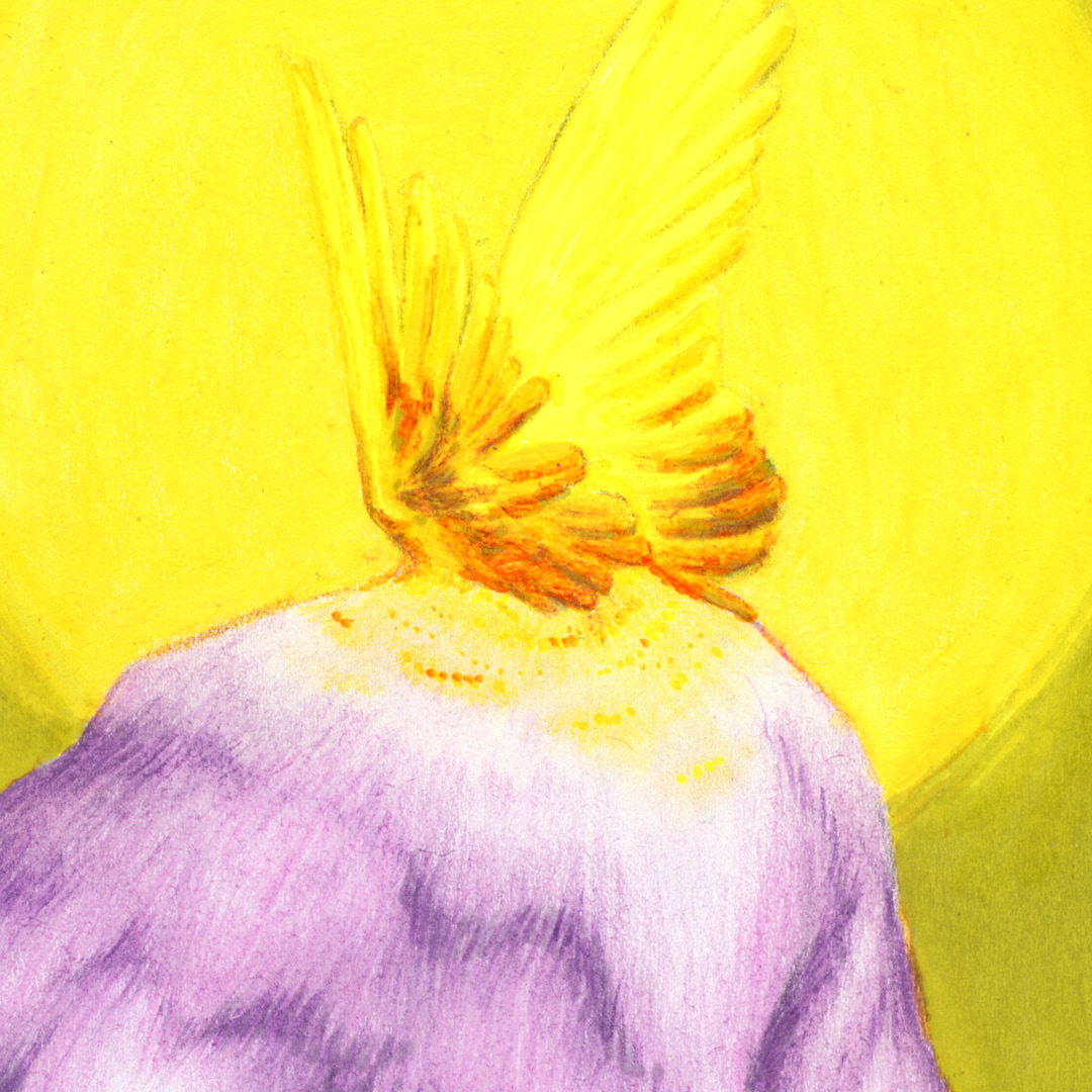
To add depth in the neon yellow wings, I lightly placed some purple and pink underneath before blending it all together with the Sharpie. Because of my earlier tests, I knew that the neon yellow and metallic purple together would create a striking orange shade that made the angelic wings stand out even more.
To maximise the use of opposites I also made the background yellow, but first mostly coloured it light grey with the Promarker, before adding the sunflower yellow Derwent Inktense on top. Both of these pens had a really smooth finish, so I knew I could get an even background using them.
The turquoise Tombow marker also had a beautiful colour, but I didn’t want its brightness to compete with the neon yellow – that’s why I only used it (on its own) in the hounds eyes, to draw the viewers attention to the dogs expressive look. Together with the purple, I also used the turquoise to make the sad little rain cloud and rain drops.
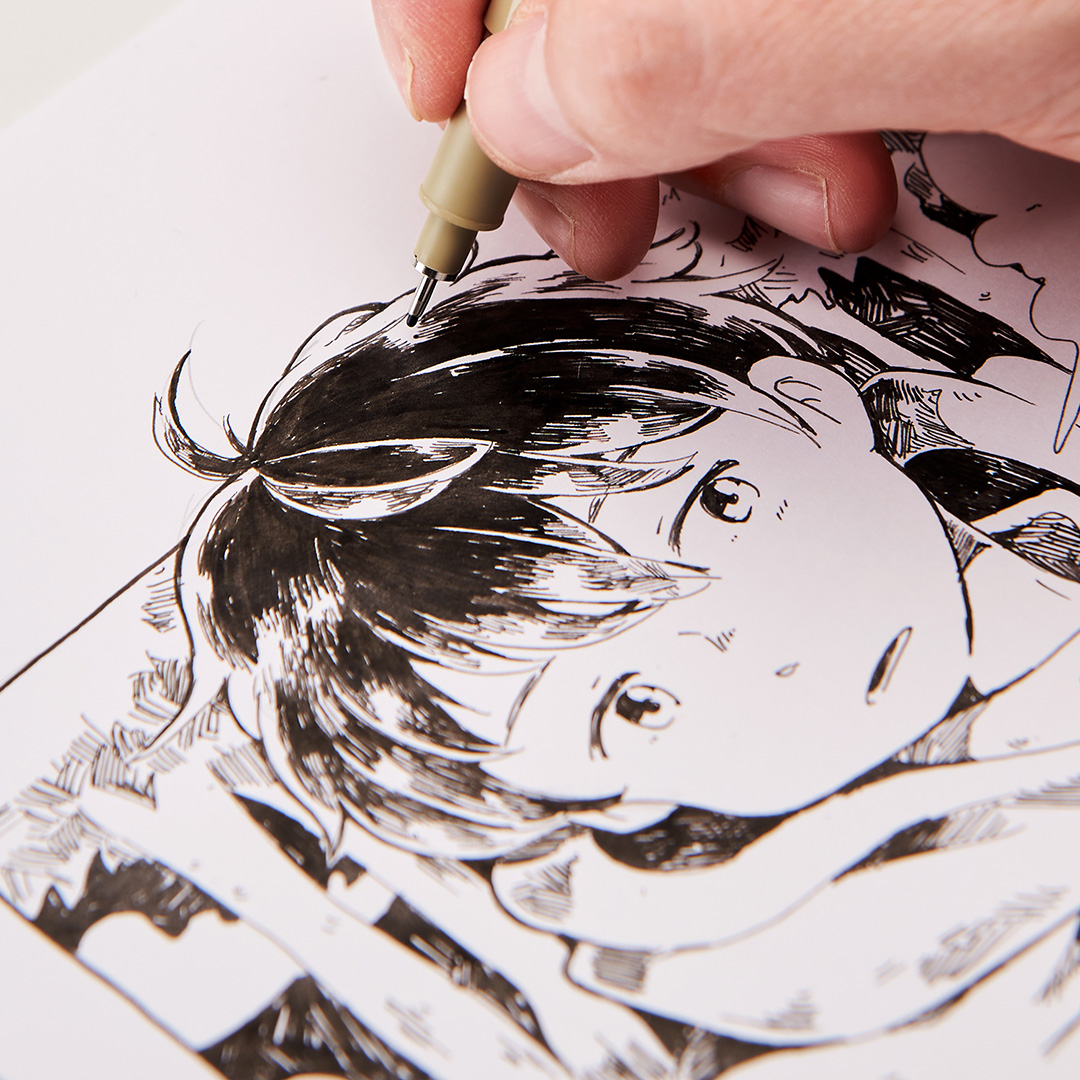
I’ve had a lot of black “heavy coverage markers”, but the Pilot Pintor really surprised me with its coverage and smooth, even finish. It was an obvious choice to use it for a heavy black shadow, as there already was a bright light in the illustration. To make the soft dog fur texture come together with the black shadow, I used the Pigma Micron for some black details and strokes. I had used Micron liners before, and knew it was perfect for those small, sharp details in the hounds fur and face, and the cloud.
What was the biggest challenge during the competition?
Self-doubt is always heavy on my mind, especially when trying out something new and knowing other people will probably see it too. During this process I doubted my choice of motif and use of colours many times – was I really going to sent in a purple dog butt?
Do you have any tips that can help if someone is stuck and can't find creativity for what to create?
With this illustration process, I have learned that I can stay on my comfort zone, but also leave it at the same time. I chose a comfortable, familiar motif, but executed it with a complete unusual colour palette that I would’ve never thought of using before this competition. I think this could also work the other way around: I could choose a new motif, but execute it with my favourite, trustworthy colour palette.
Are these any of the pens that you will be using going forward?
The black Pilot Pintor I will be buying again and again, and the soft and blendable metallic Super Ferbys also peaked my interest. And above all, I will definitely get my hands on more neon Sharpies, just to brighten up my life.
What was your first reaction when you found out you had won?
Of course I had scrolled through Instagram to see other people’s works, and I did not feel confident. Other artists had such unique ideas and detailed, complicated works – they actually drew backgrounds and everything! So I was absolutely baffled (but honoured!) when I heard about the shared second place.
What will you buy for the prize money?
I actually already have bought something! When using oil paints, I prefer an unprimed linen base to primed white cotton, but those kind of canvases are hard to find (on a reasonable prize at least). So when I scrolled through Pen Store and saw un-primed linen canvases I had to buy a bunch of them in different sizes. My plan is to create a series of paintings, maybe for a future exhibition!
Petra Oravakangas
@petraoravakangas


 Ireland (EUR)
 France (EUR)
 Germany (EUR)
 Netherlands (EUR)
 UK (GBP)